My Role:
Product Designer in a cross-functional team
Product Designer in a cross-functional team
Timeline:
2019 - 2020
2019 - 2020
Tools:
![]()
![]()
![]()



Project overview
The Royal Caribbean Web Tools User Interface is a CMS composed of different features intended to be used by the employee side, specifically by the Department and Digital Managers onboard. This web application will house up to 8 different features which will allow managers to support features on the mobile crew app as well as allowing digitization of manual processes done on the ship such as crew event creation, print requests, broadcast messaging and others.

HR and Digital managers currently do everything by hand. Meaning, that to create an event or printouts they have to print a paper to request such things

Digitize all processes done by hand on board by creating a Content Management System. This will allow better communication between managers and crew members.
![]()
The Distribution page will allow crew members to download the Crew App to their devices, they’ll be able to see the instructions for download applicable to iOS and Android. *Deliverables were provided in a two week sprint period.
Feature


Feature
The broadcasting messaging feature allows managers to communicate important messages to some members or the entire crew onboard
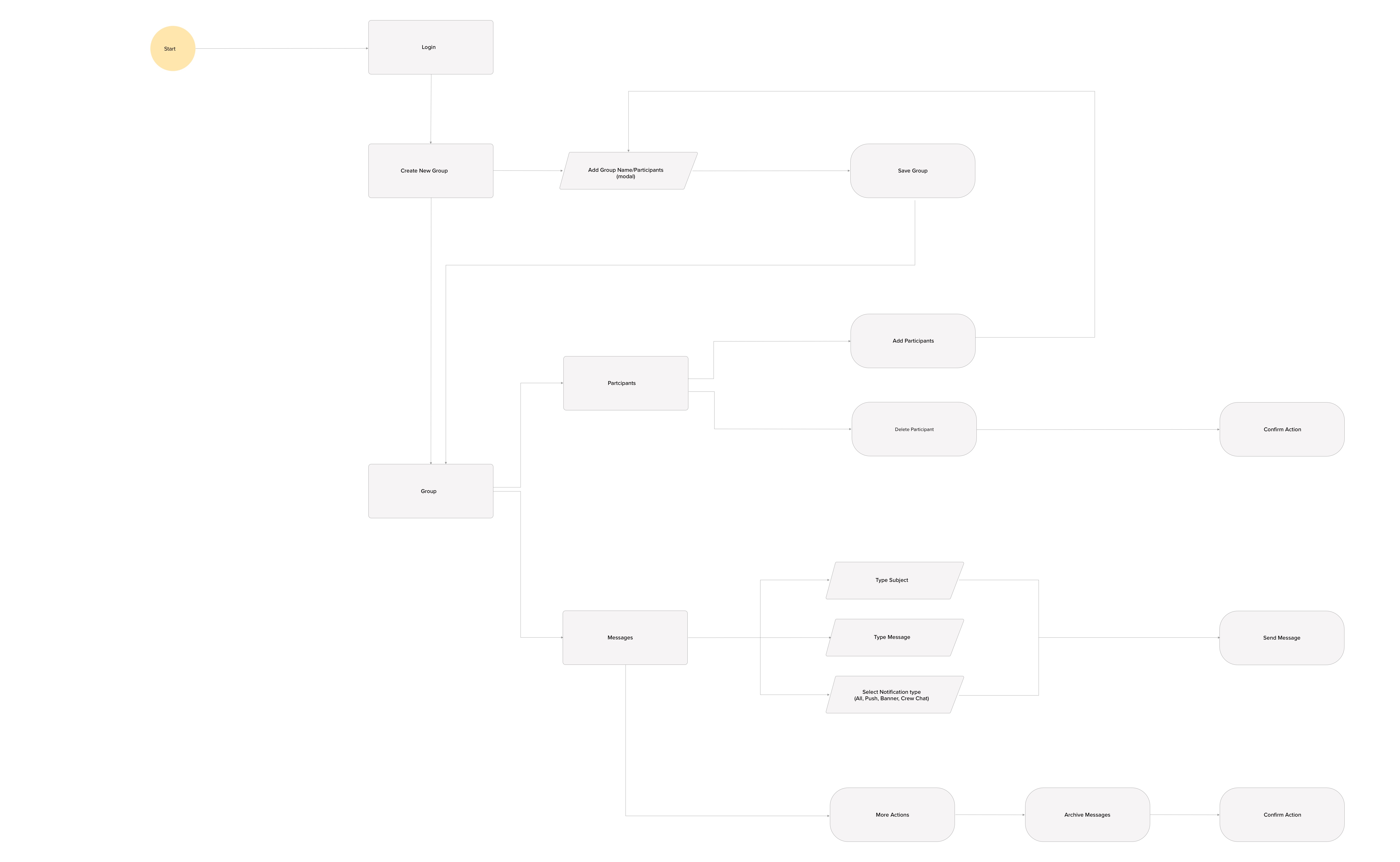
Once requirements were provided and before diving into the design, I like to have an overview of all tasks being performed by the user. Therefore I start with task flow.The main requirements are for the user to create a group, add participants and send a message.
*Deliverables were provided in a two week sprint period.
*Deliverables were provided in a two week sprint period.
Competitive analysis
I started looking for inspiration and understanding what was out there. I evaluated several products to understand flow and patterns being implemented. Explorations went from Google, Slack, Whatsapp, Outlook and others.

After reviewing all products, I understood that layout and visibility were essential to guide the user.
Lo-fi wireframes
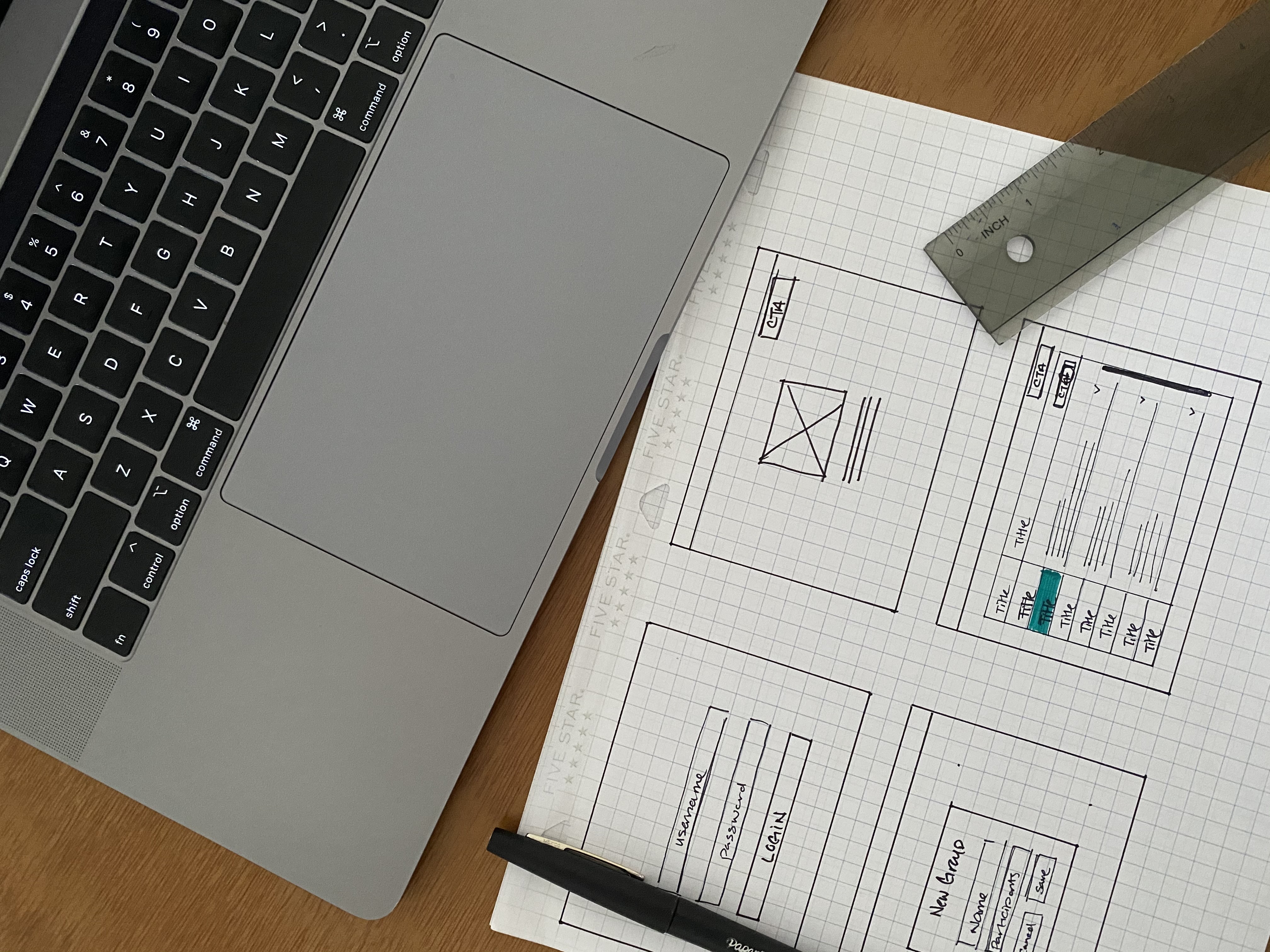
These rough wireframes help me organize how the content will be displayed. The main requirements are for the user to create a group, add participants and send a message.
Explorations
User Interface has begun! Leveraging our Design System, I started exploring with the interface and interaction. Below some examples.
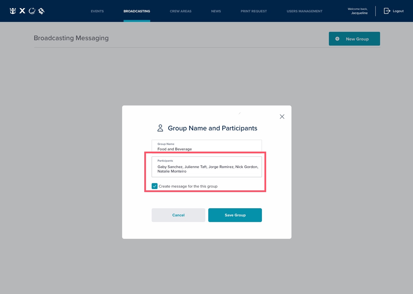 V1. Adding participants
Dynamic text pattern used to search participants. This was not the best treatment as all names are consecutive and is not clear how to delete a name.
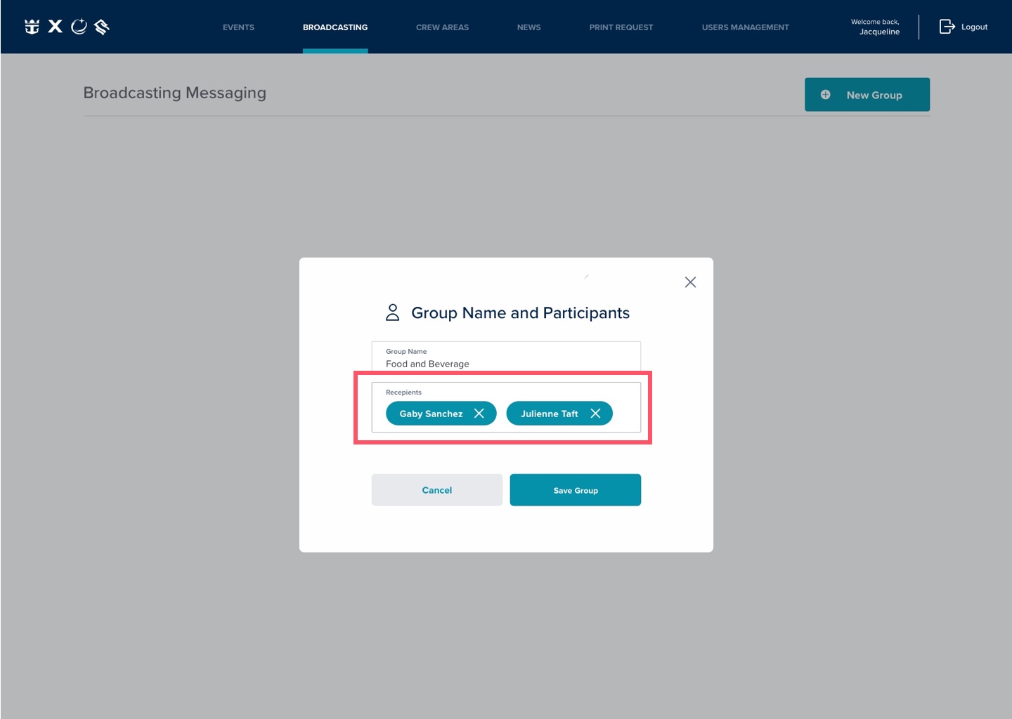 V2. Adding participants
Dynamic text pattern used to search participants. The pill treatment allows the user to easily delete a participant. yet the pills seem to crowded within the box.
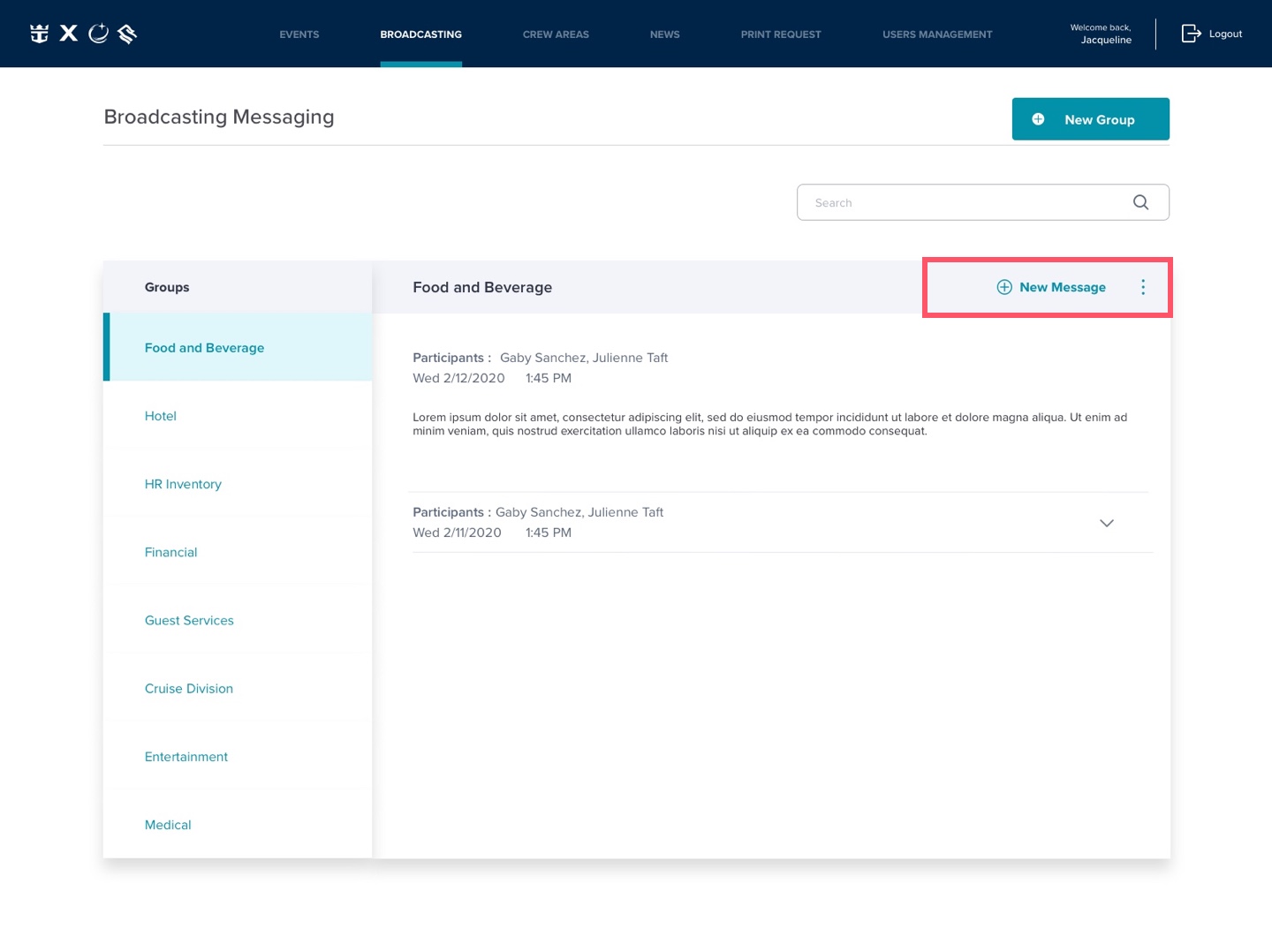
V1. Adding message
In this instance a CTA was included to create a new message. Once pressed, a pop would appear to create the message. I moved away from this solution to simplify the task.
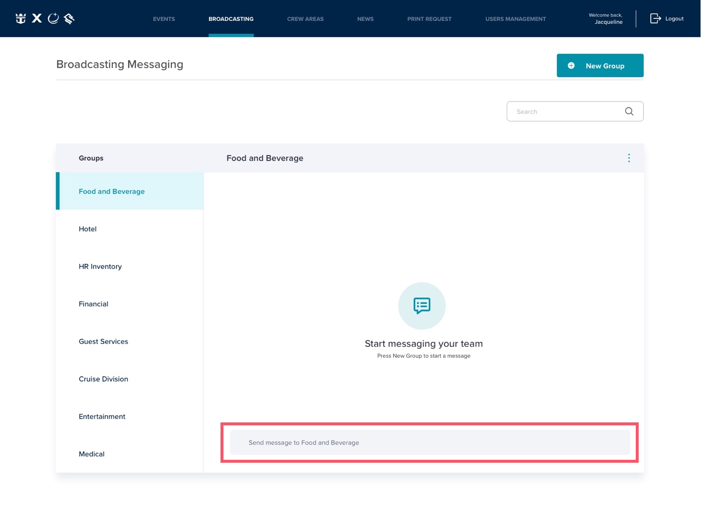
V2. Adding message
The message box is always available allowing the user to start interacting with the task.
Hi-fi wireframes
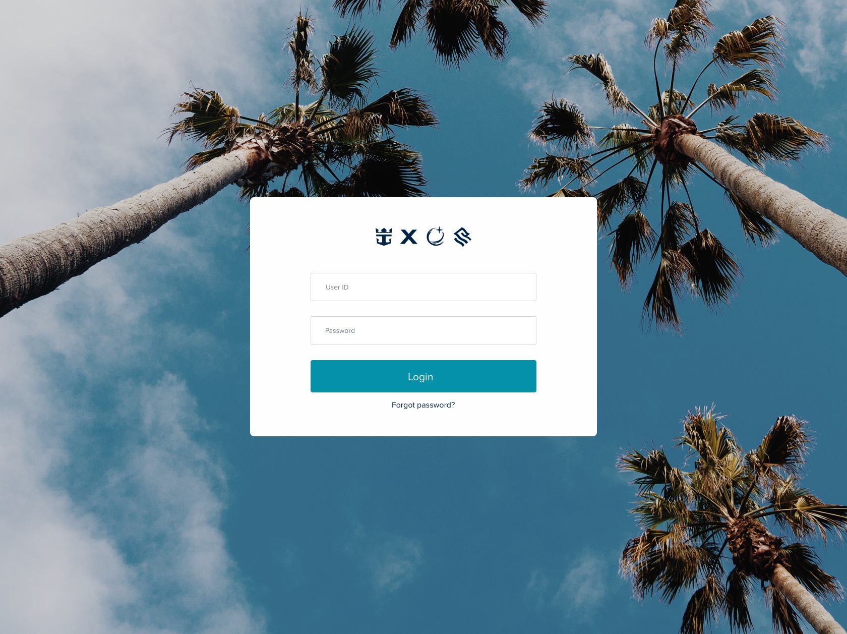

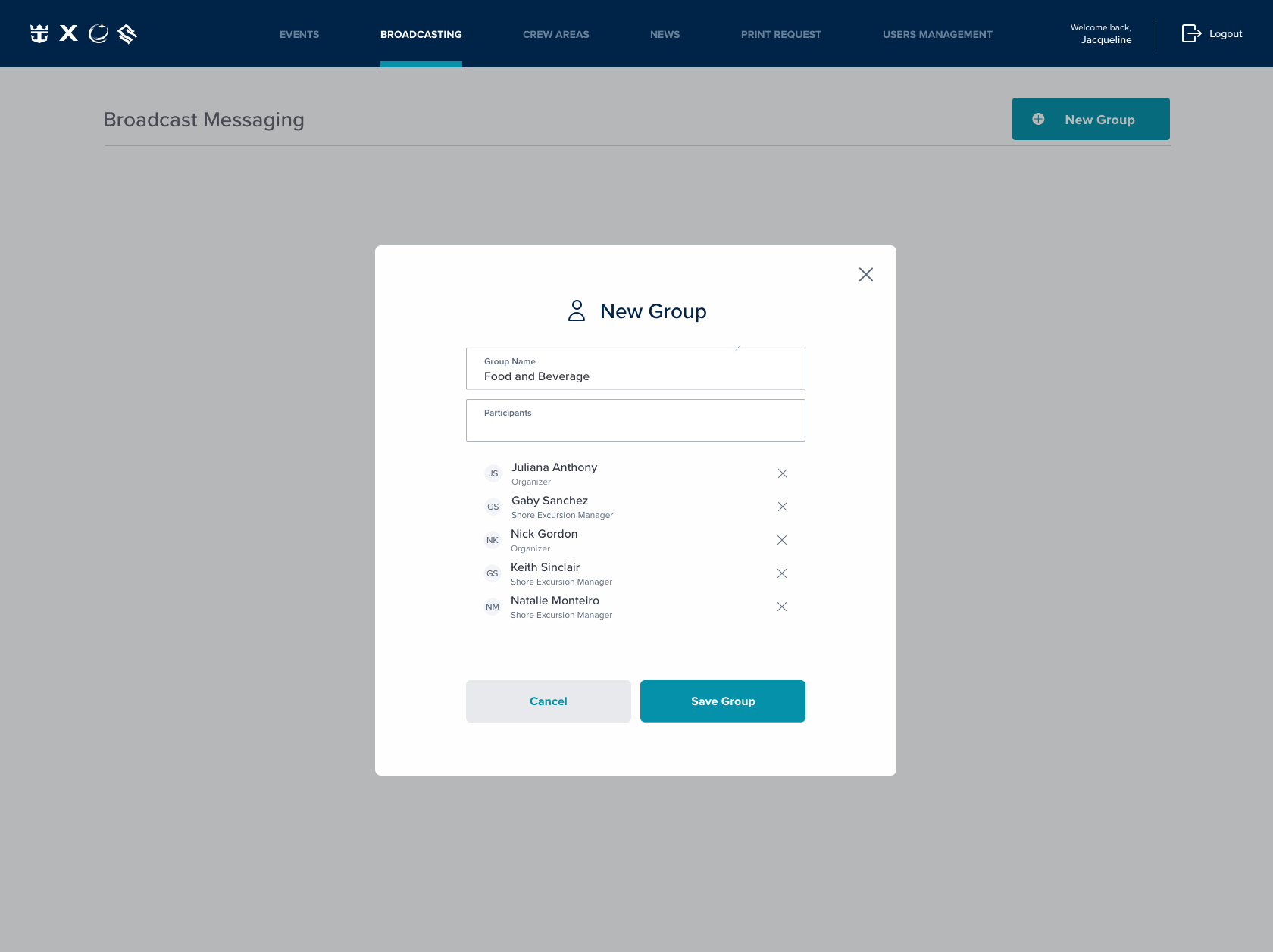
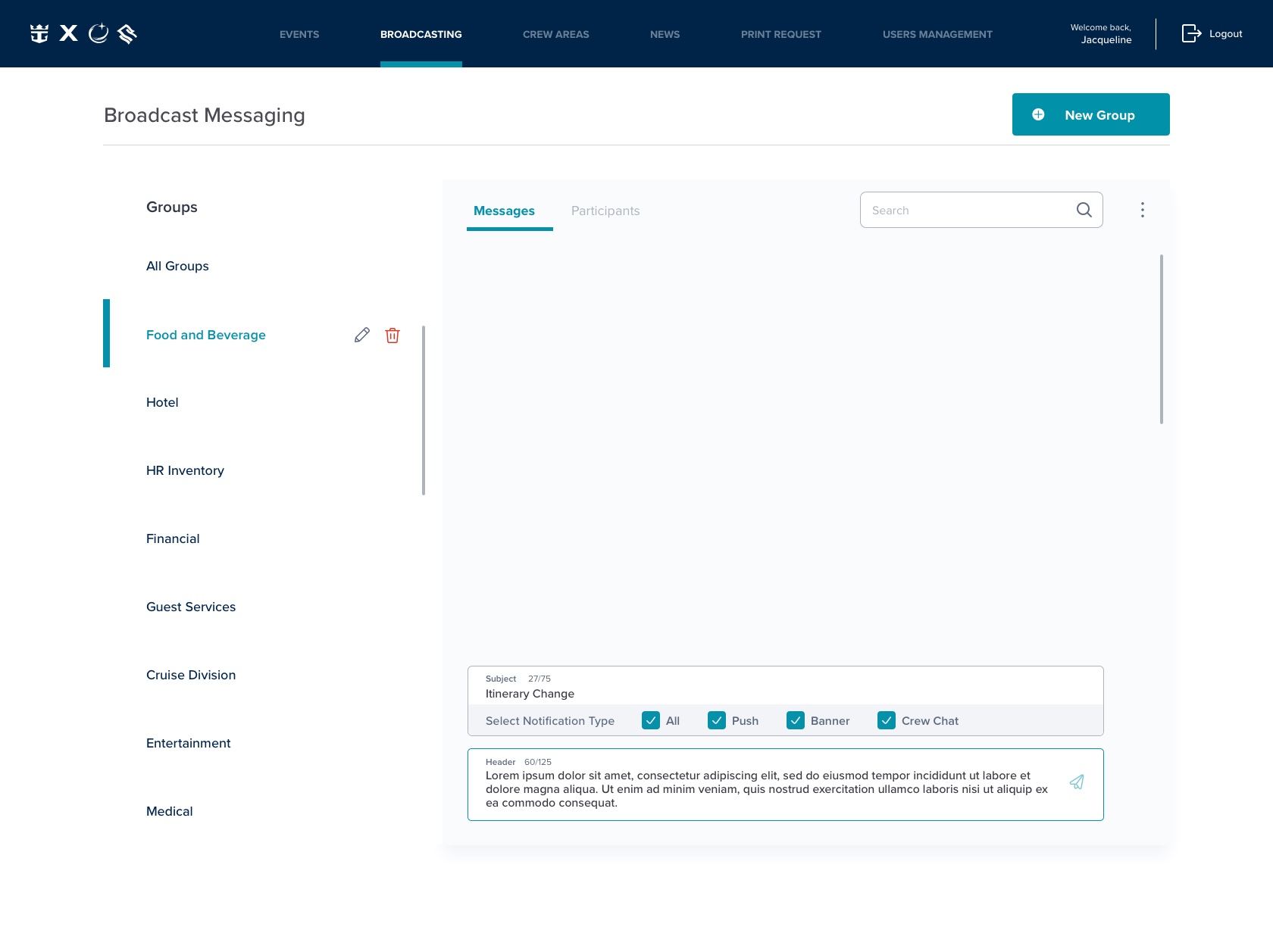

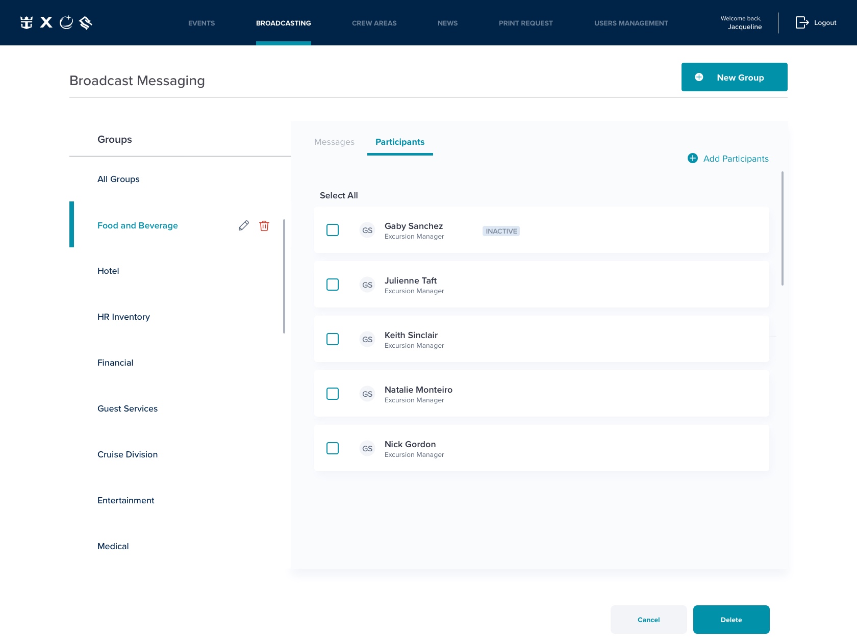
Invision prototype [HERE]
Feature
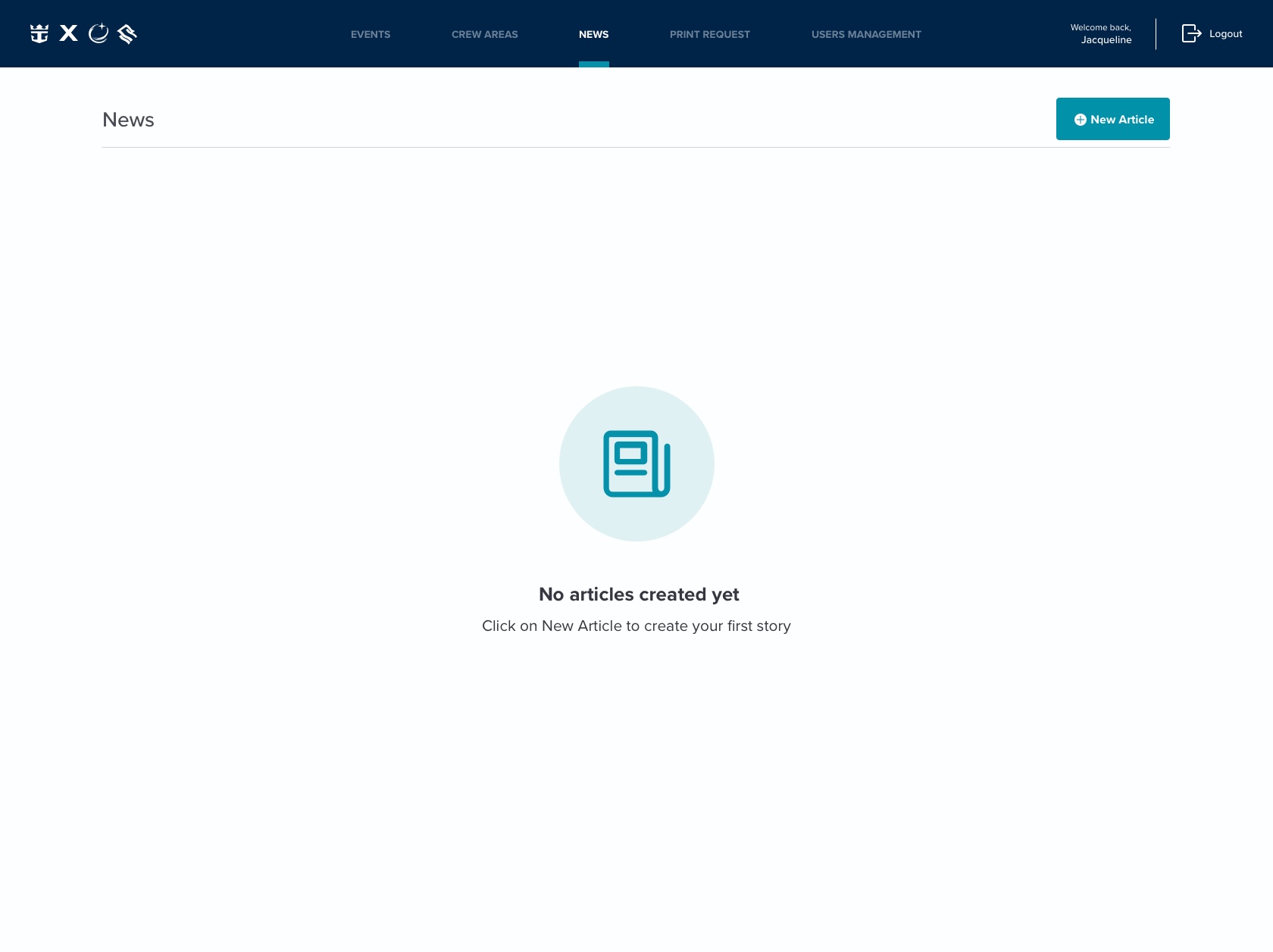
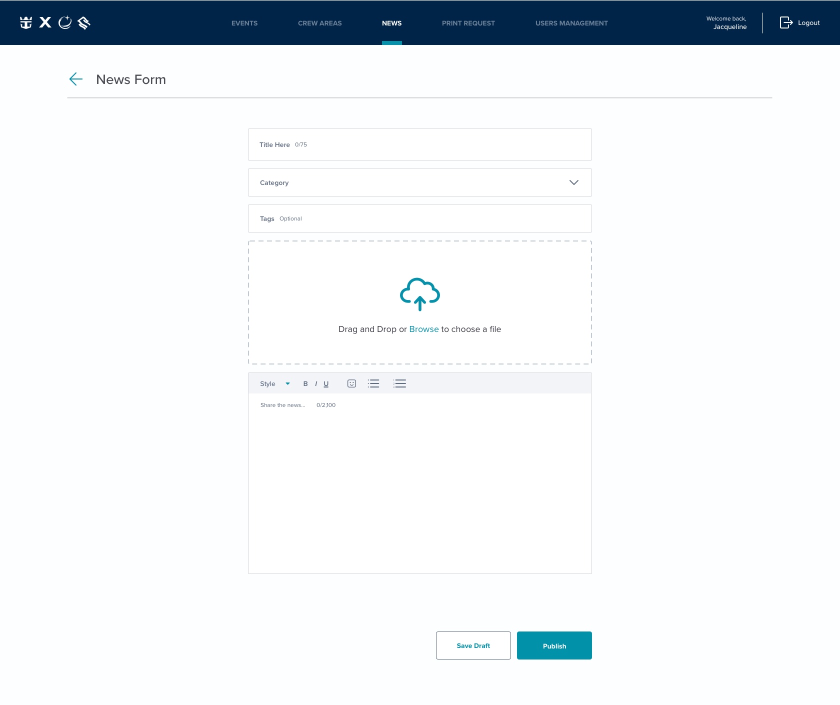
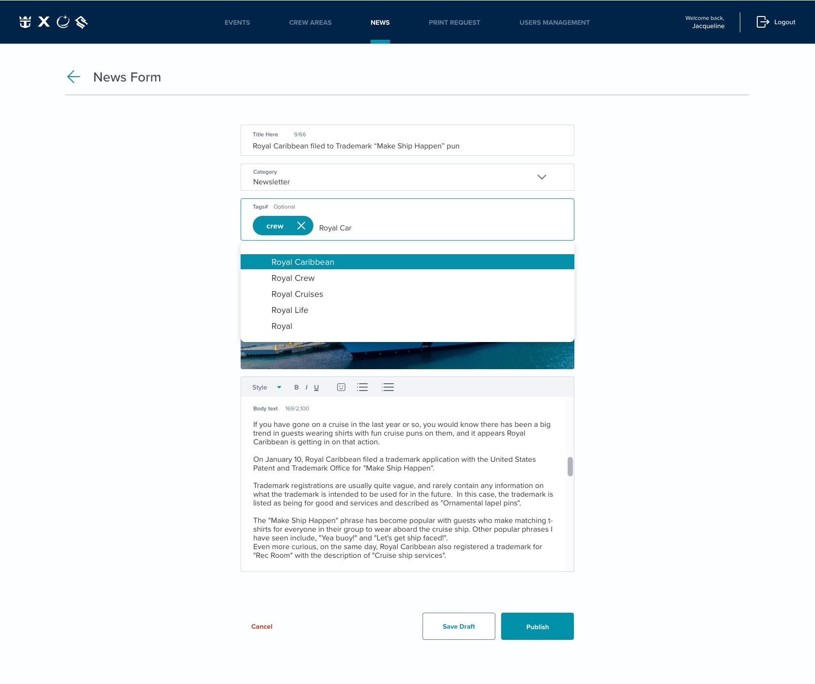
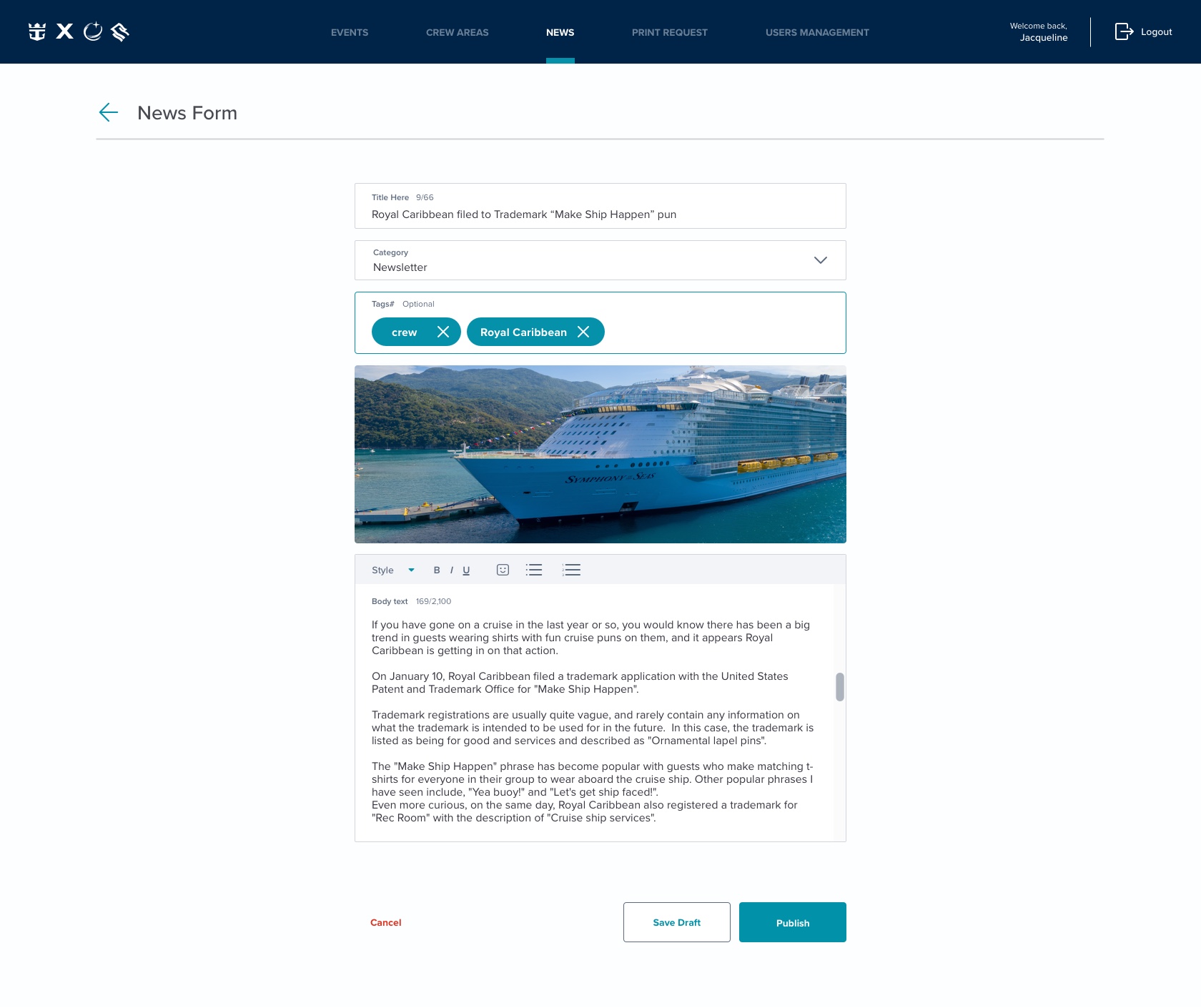
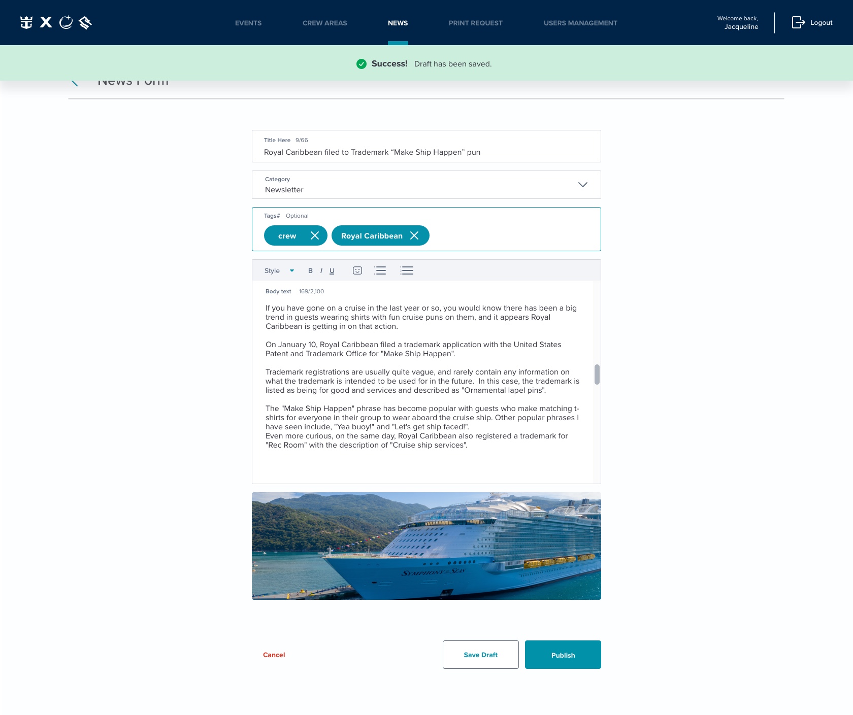
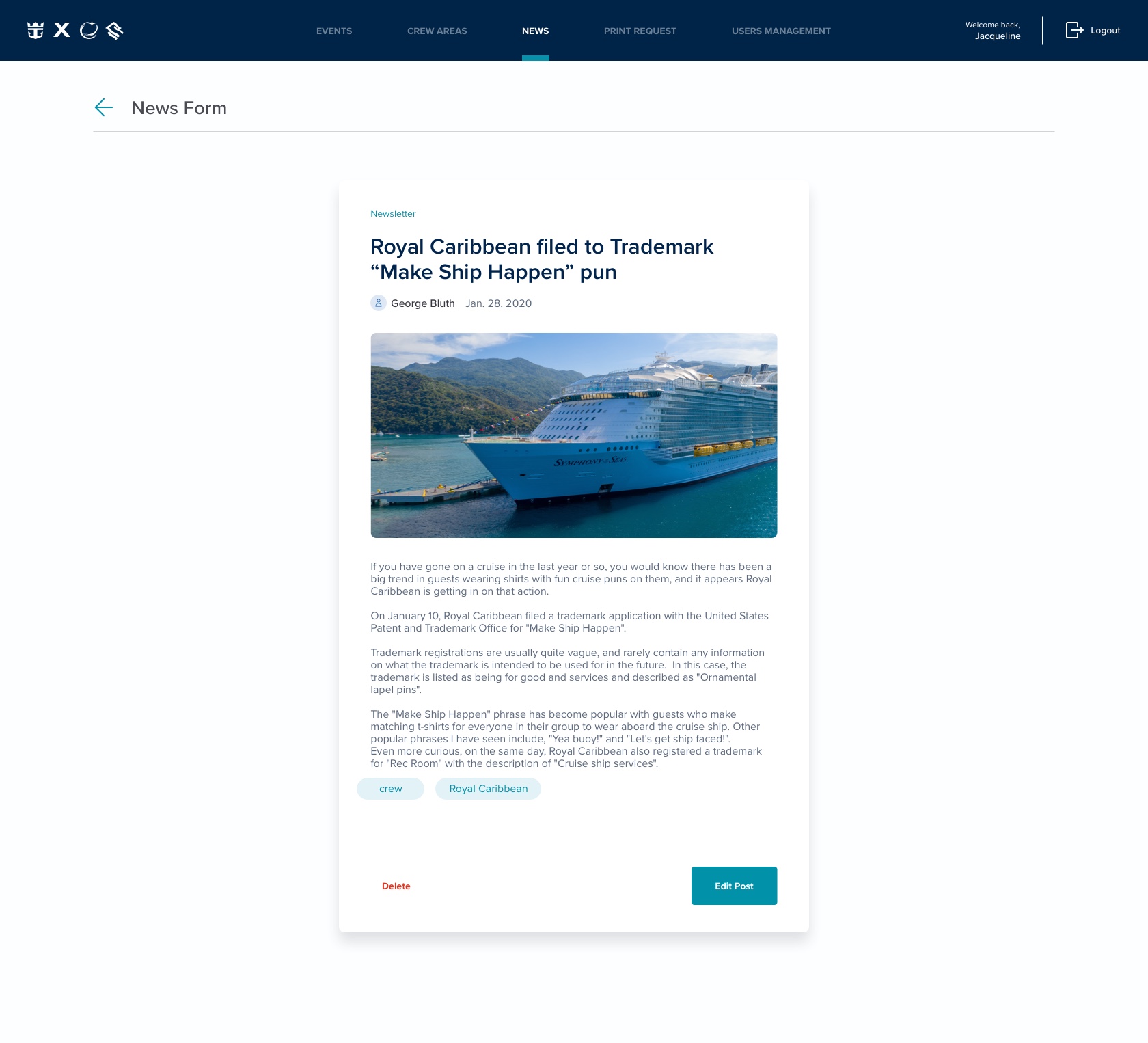
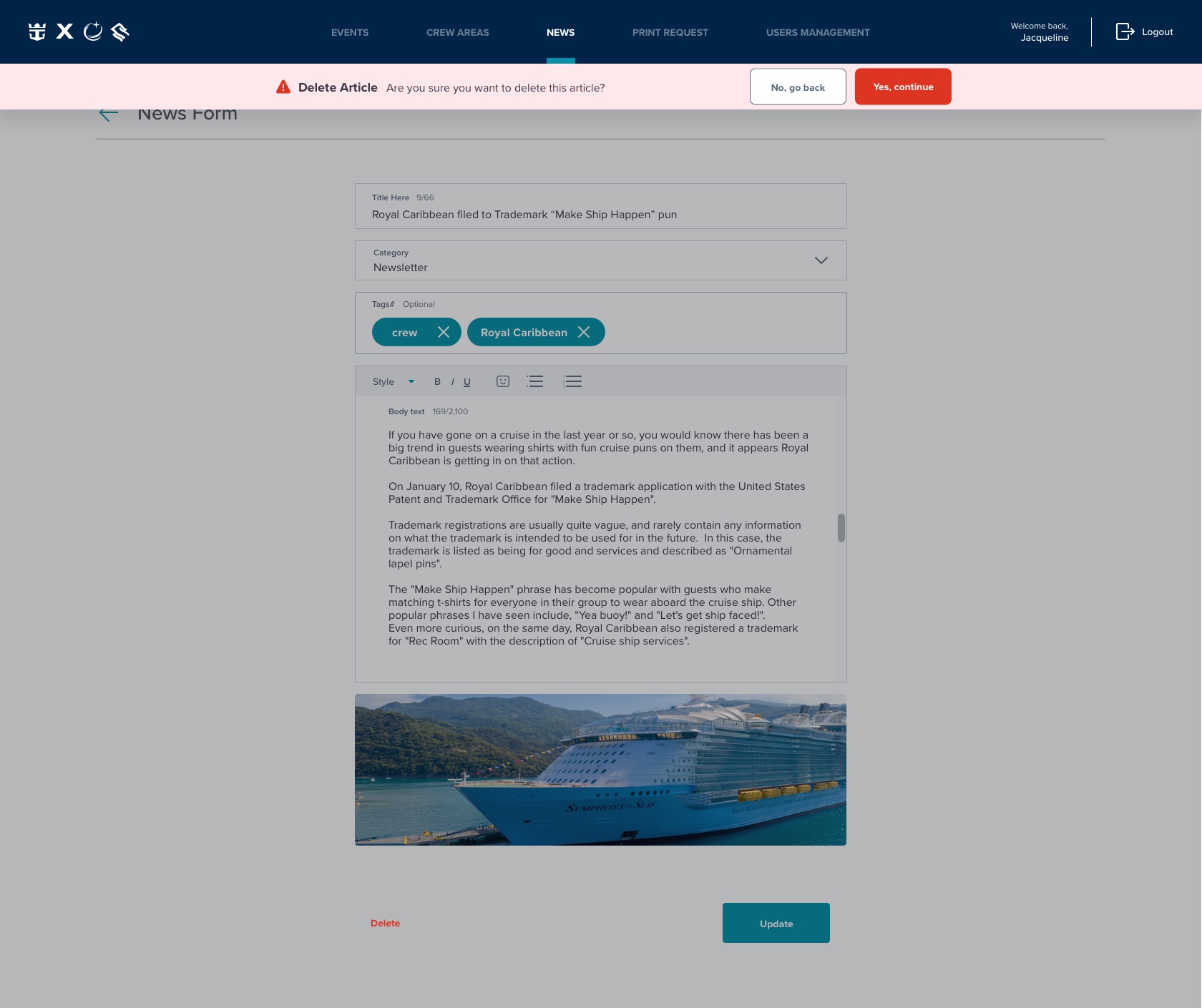
The News feature within the Web Tools platform will allow the manager to communicate and share important news specific to each ship. This solves the challenge of informing the employees in a conventional matter and allowing the crew members to easily view all news through the crew app.

