
My Role:
UX/UI Designer
UX/UI Designer
Timeline:
2018 - 2018
2018 - 2018
Tools:
![]()
![]()
![]()
![]()


Feature
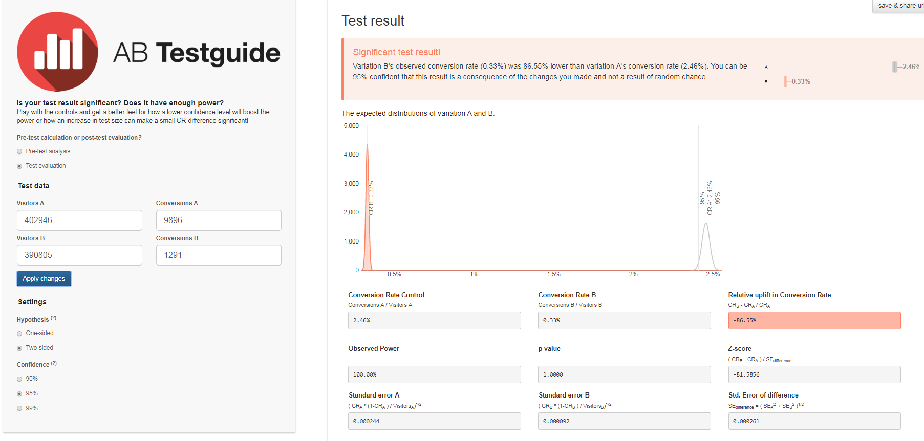
Courtesy Hold is a feature within the Carnival website that allows customers to hold their reservations for 24 hours before committing to complete the transaction. The goal is convert those courtesy holds onto an actual booking.

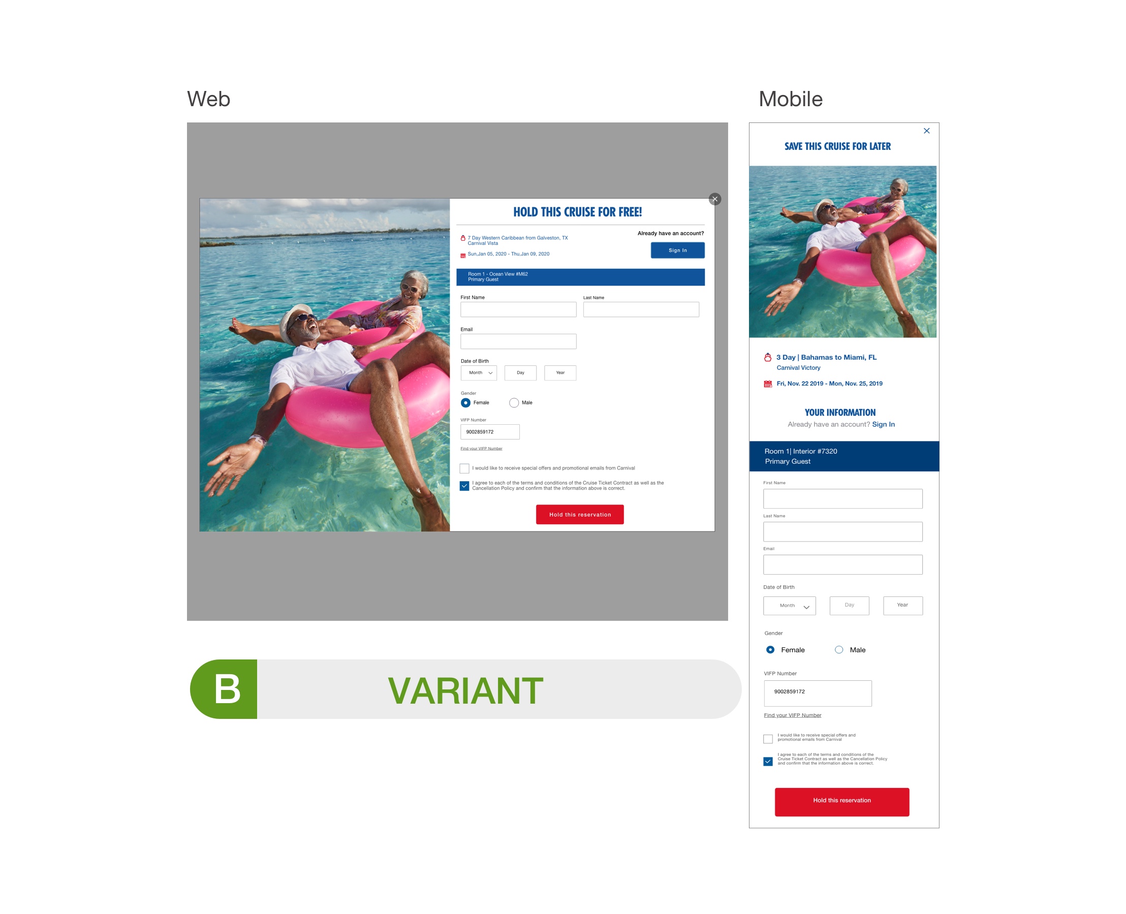

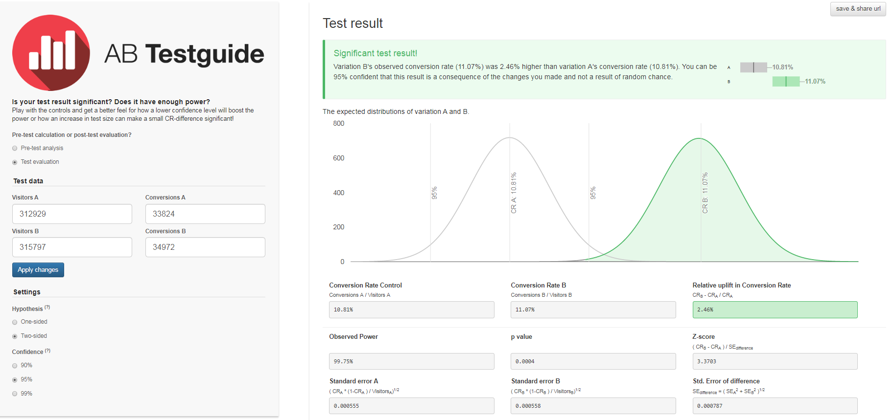
Result: We’re seeing a 7% lift in hold submission rate and no negative impact on conversion through the booking flow.
Insight: a new design is not enough to drive an increase in CH take rate because it is not the image or layout of the form that is an issue. In order to get an increase in CH take rate we may have to revise our strategy from a mitigation modal to a user-centric hold/save strategy.
Insight: a new design is not enough to drive an increase in CH take rate because it is not the image or layout of the form that is an issue. In order to get an increase in CH take rate we may have to revise our strategy from a mitigation modal to a user-centric hold/save strategy.
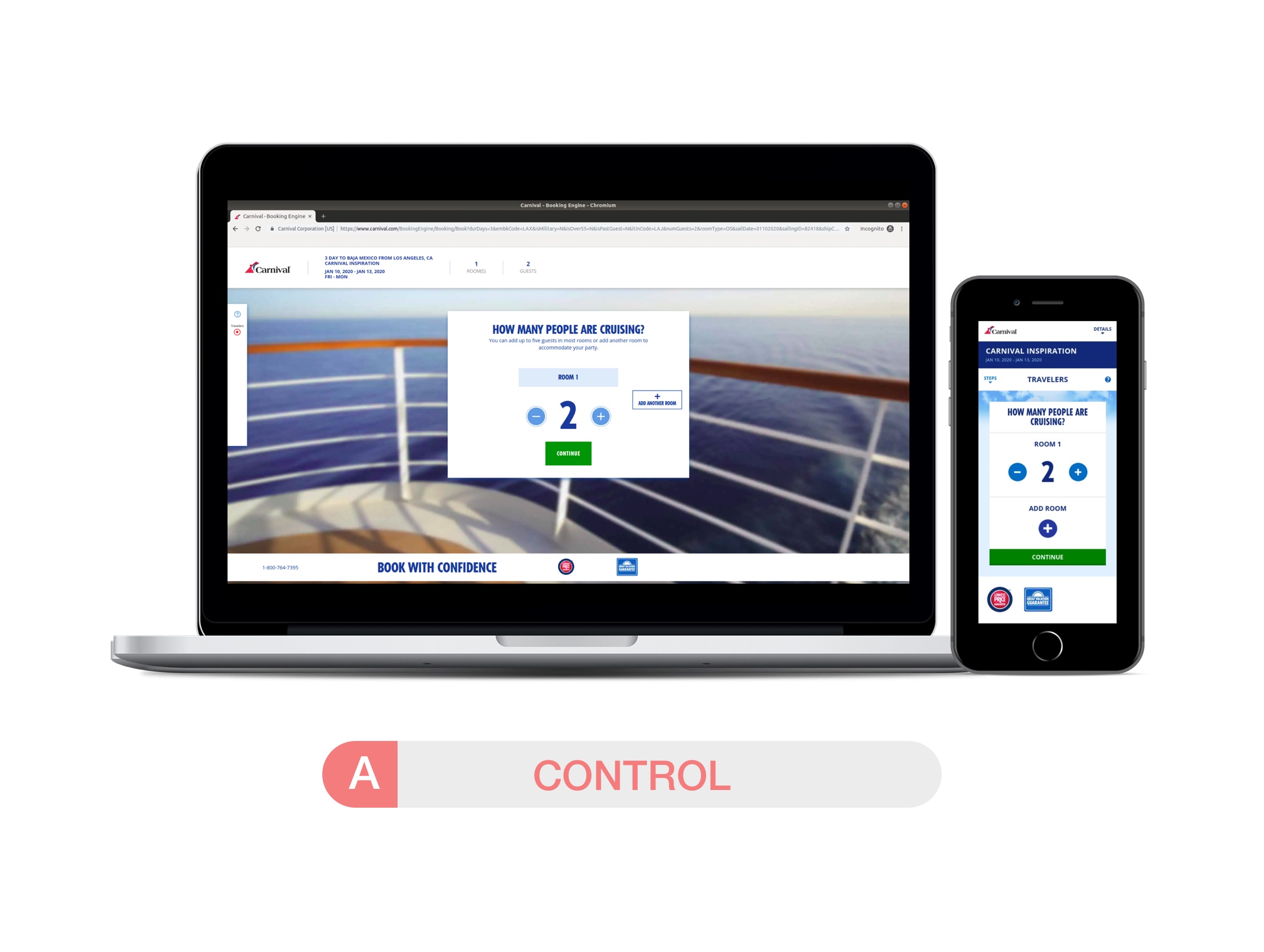
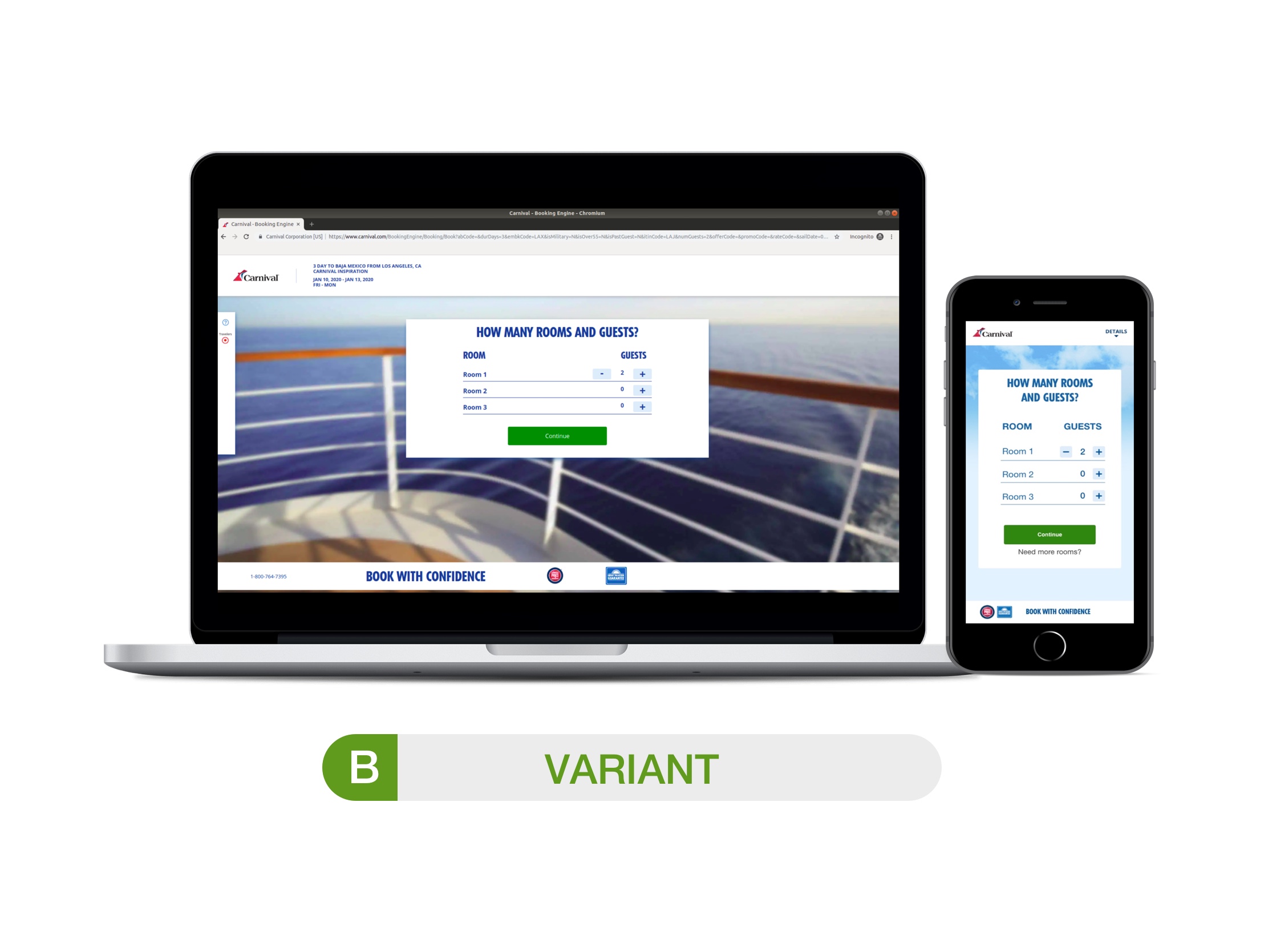
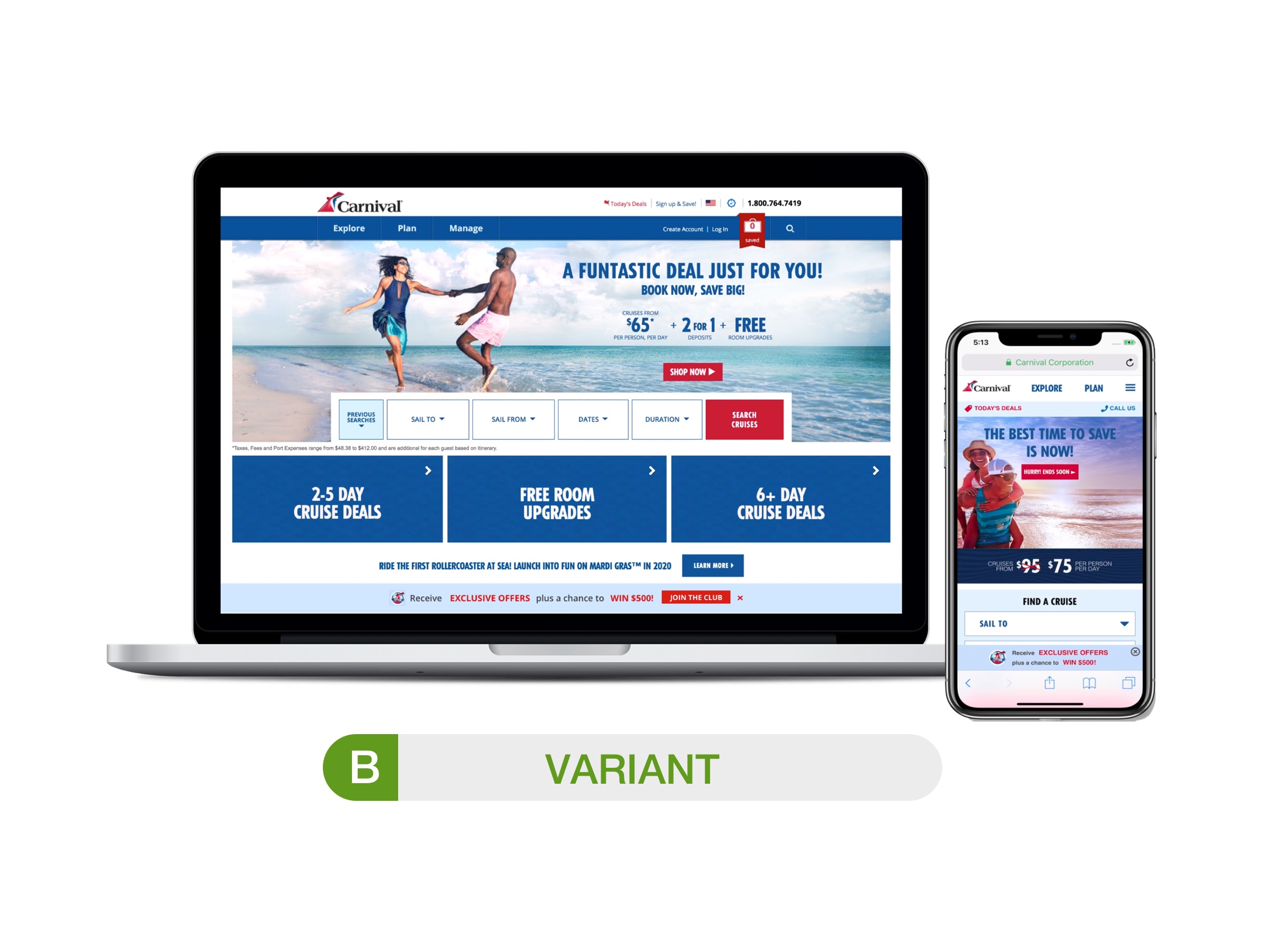
Feature
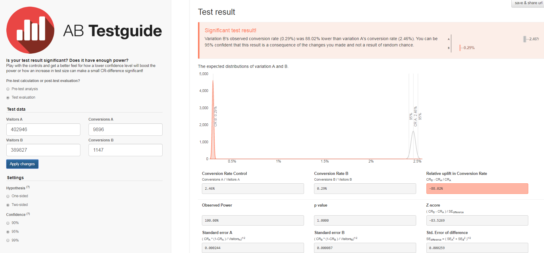
Stateroom selection is a feature within the booking engine of Carnival that allows the user to decide on the amount of rooms and guests to be part of the trip. The objective is to reduce confusion and better the experience by improving the interface of the first step “Number of Room & Guest” in order for the user to progress to the next step and complete their bookings.
Findings and observations
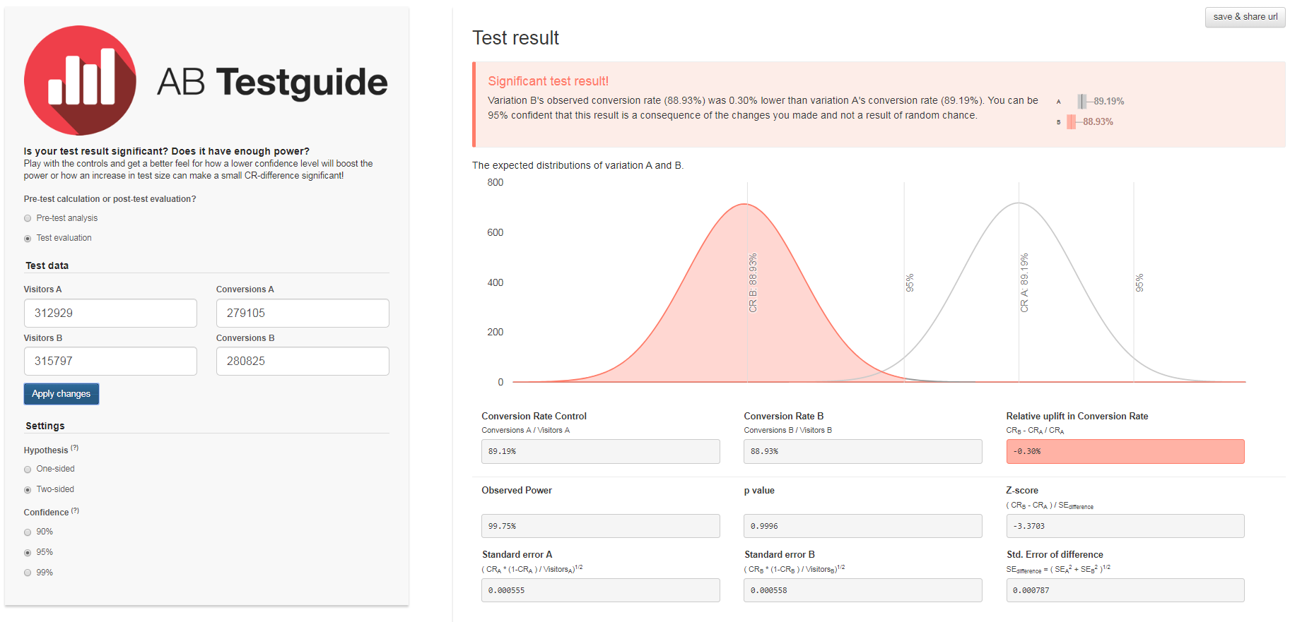
Result: No significant impact was noticed on checkout conversion or booking rate but we saw a significant 2.46% increase in step abandonment and a
- 0.3% drop in next step conversion
Insight: The new design created more confusion/friction for visitors.
- 0.3% drop in next step conversion
Insight: The new design created more confusion/friction for visitors.
Feature
Based on a test performed back in July 2019, we see that Pop-up messaging for VIFP (Exclusive offers and $500 sweepstakes) lead sign up was effective at increasing lead sign-ups versus the standard Butter Bar.
The goal of the VIFP Sweeps is to increase lead's.
The goal of the VIFP Sweeps is to increase lead's.
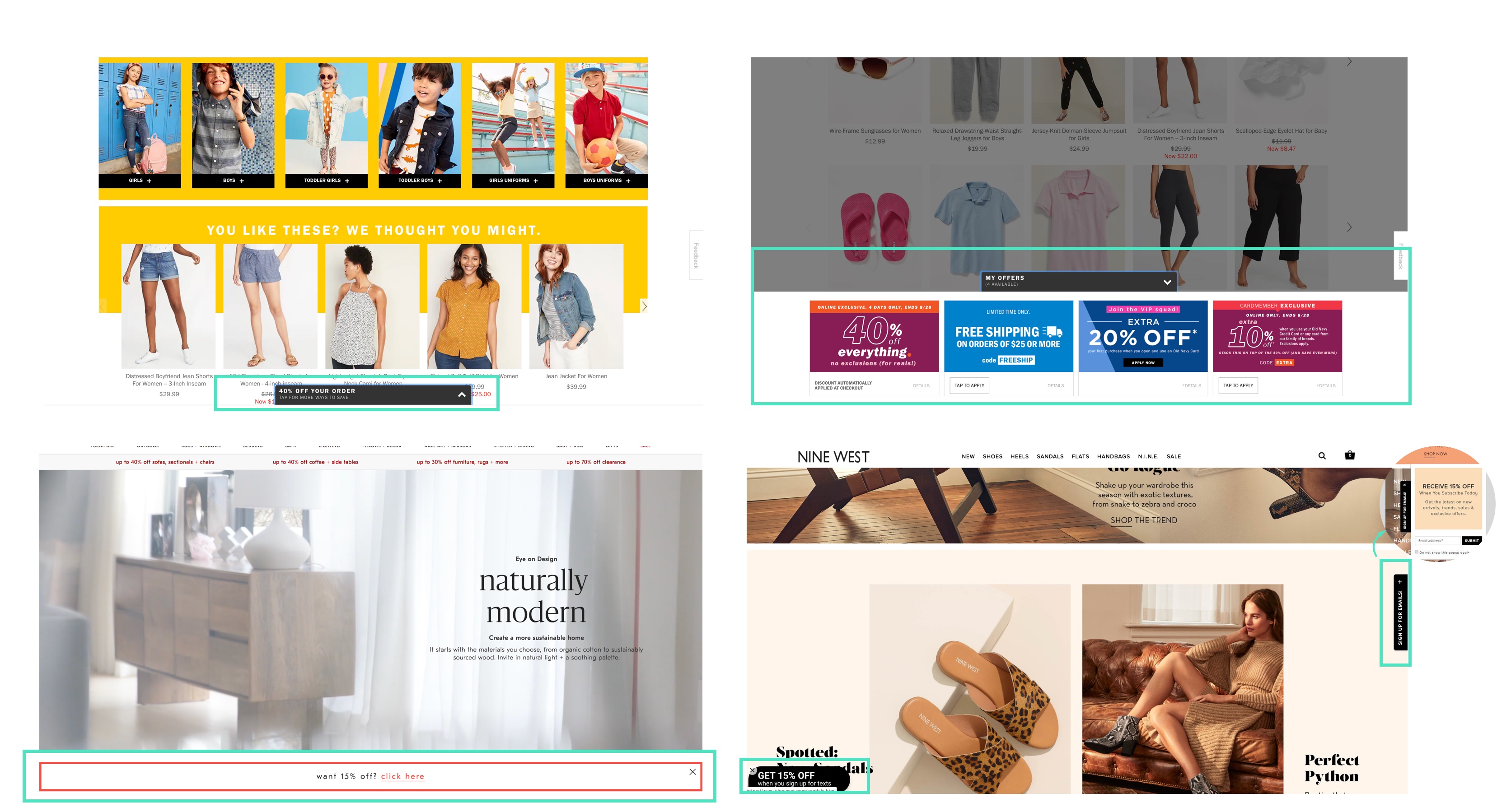
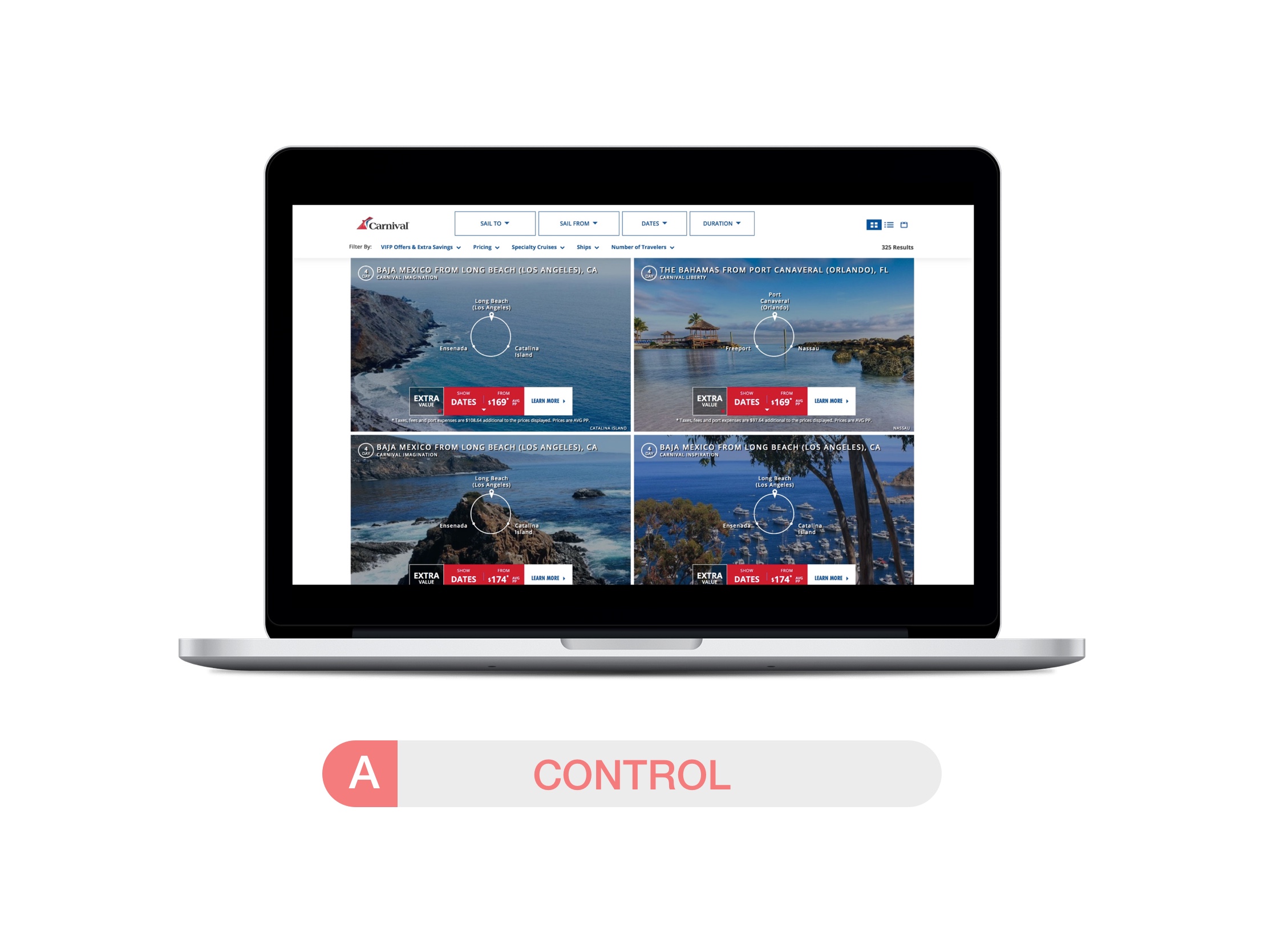
Competitive analysis
Before starting the design exploration and ideation, I started by researching what patterns were implemented by other industries. I gathered samples from West Elm, Gap, Old Navy and Nine West to get inspired within my design process.
Explorations
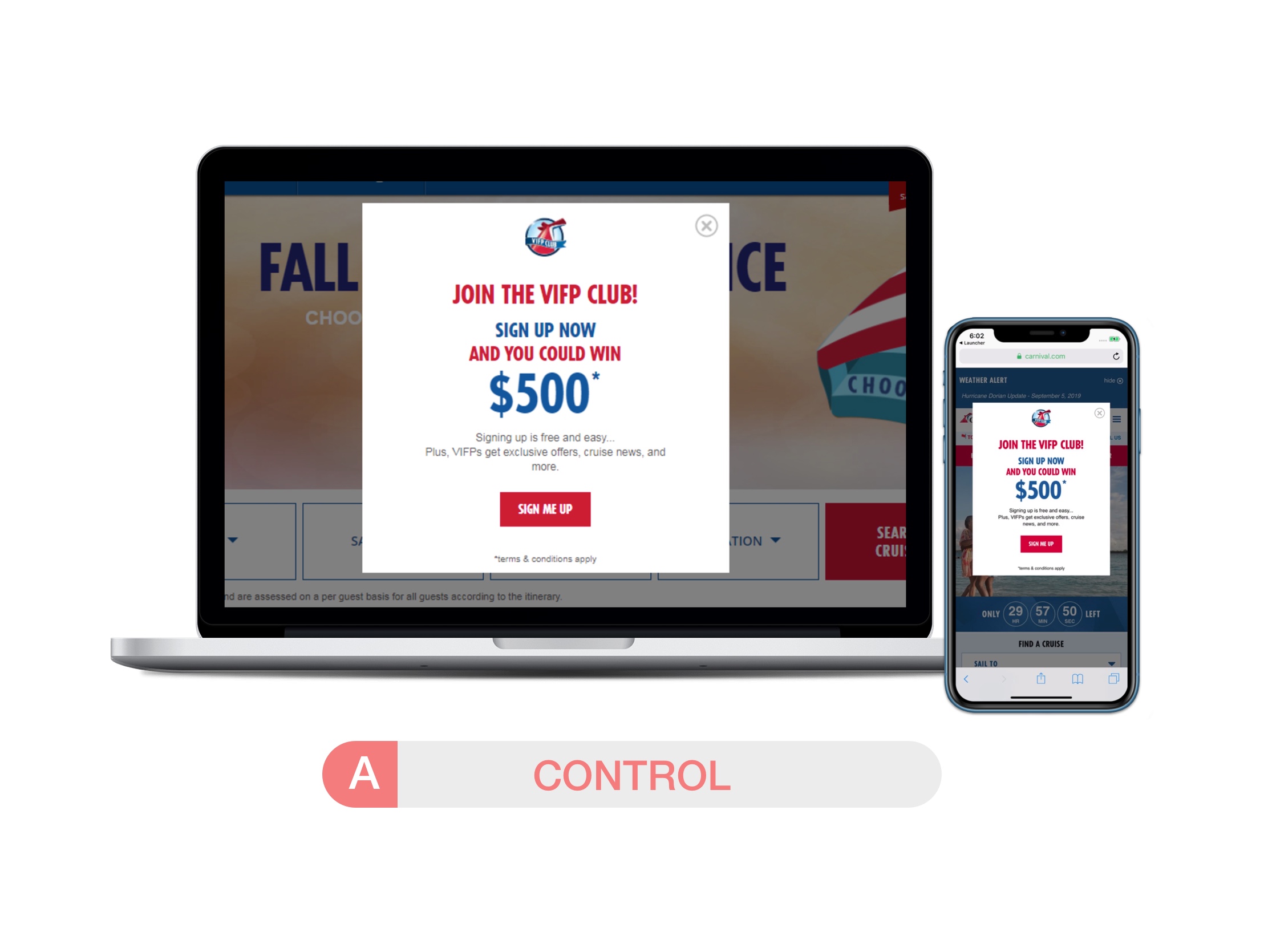
Test 1 | Variation1
Pop-up side box with sticky tab - Sticky side-pop up that scrolls with the user. If
the user wants to minimize, the tab remains viewable
Pop-up side box with sticky tab - Sticky side-pop up that scrolls with the user. If
the user wants to minimize, the tab remains viewable
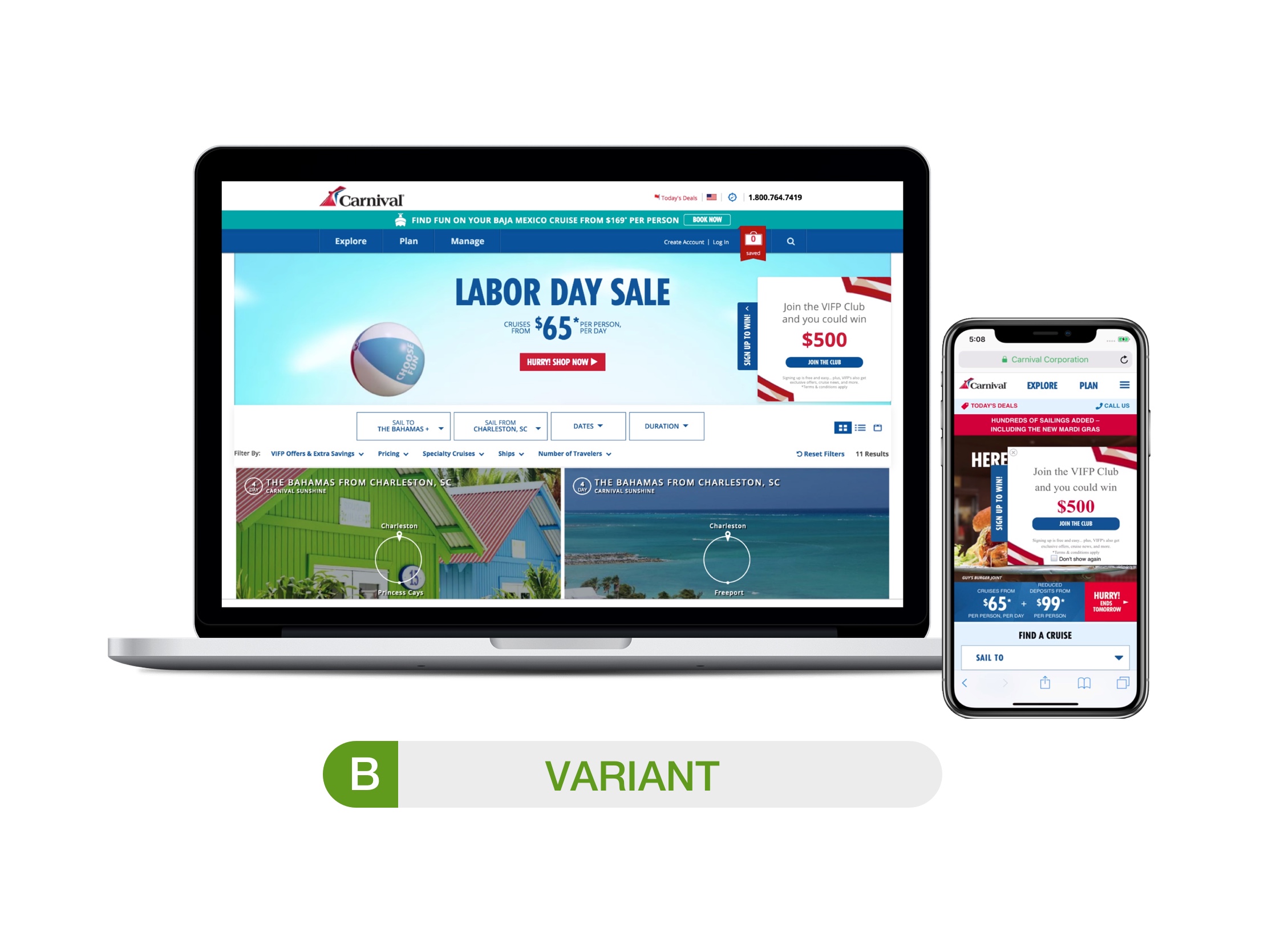
Test 2 | Variation 2
Pop-up side box with sticky tab - Sticky side-pop up that scrolls with the user. If
the user wants to minimize, the tab remains viewable
Pop-up side box with sticky tab - Sticky side-pop up that scrolls with the user. If
the user wants to minimize, the tab remains viewable
Findings and observations
Insight: we realize a direct pop-up is more prominent than the softer options tested, which is why it is much more effective at driving leads. Some observations made by the team include utilizing the side widget with more appealing call out such as “Win $500!” and adding some animation to make it more visible.
Feature
Log in message to see special rating
The Log in message within the Carnival website will sho guests that are unauthenticated a log in for special offers inside cruis search grid which can increase the amount of guests going into the bookin funnel. If we show guests that are unauthenticated a log in for specials an they create an account, we will increase leads with a potential for booking.
The Log in message within the Carnival website will sho guests that are unauthenticated a log in for special offers inside cruis search grid which can increase the amount of guests going into the bookin funnel. If we show guests that are unauthenticated a log in for specials an they create an account, we will increase leads with a potential for booking.
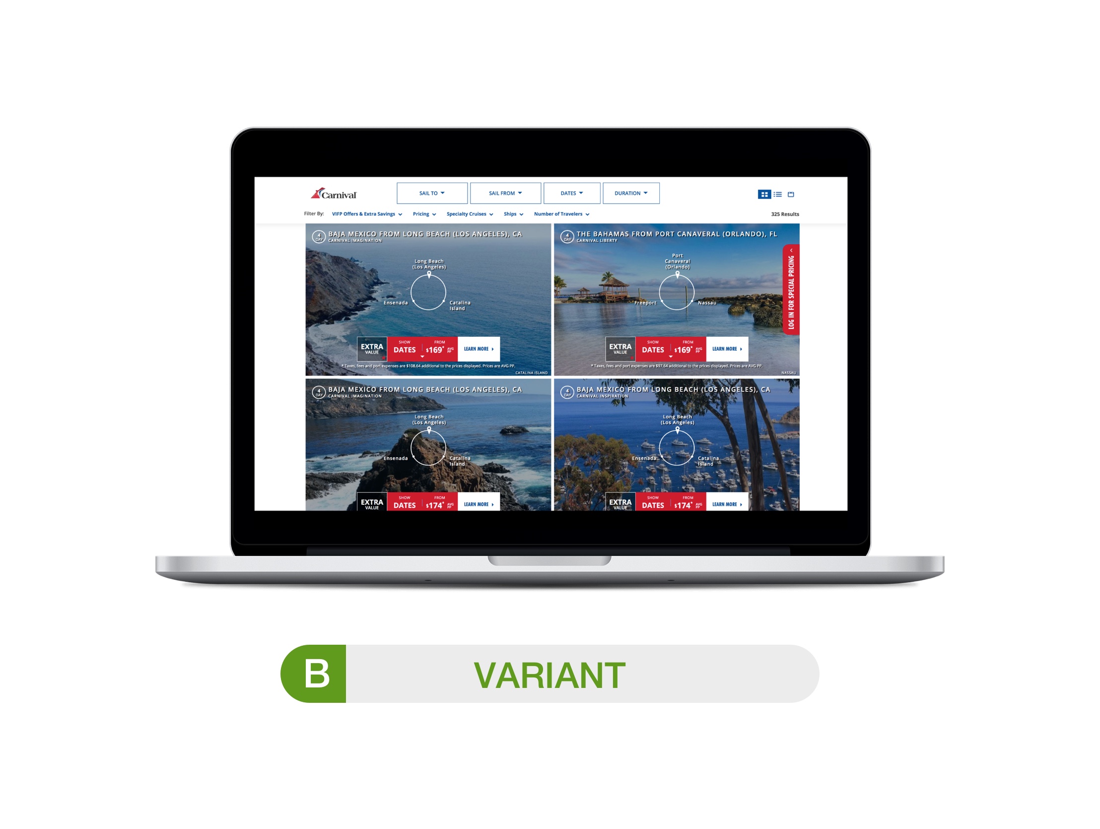
Findings and observations
The search log in widget had a 4.8% click-rate. It drove significant 19.89% lift in user login rate and decreased search page exit rate by -1.6%. No significant impact to paid bookings but we did see a -9.7 significant drop in CH bookings.

