My Role:
Sr. Product Designer in a
cross-functional team
Sr. Product Designer in a
cross-functional team
Timeline:
Jan 2021 - Oct 2021
Jan 2021 - Oct 2021
Tools:
![]()
![]()
![]()


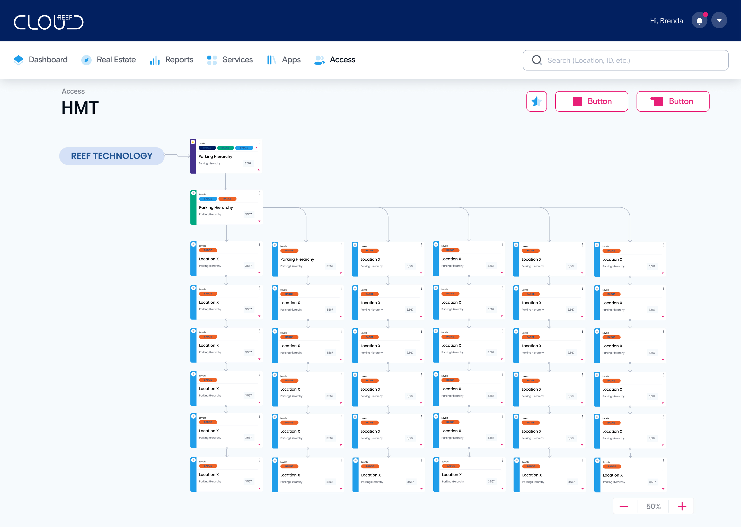
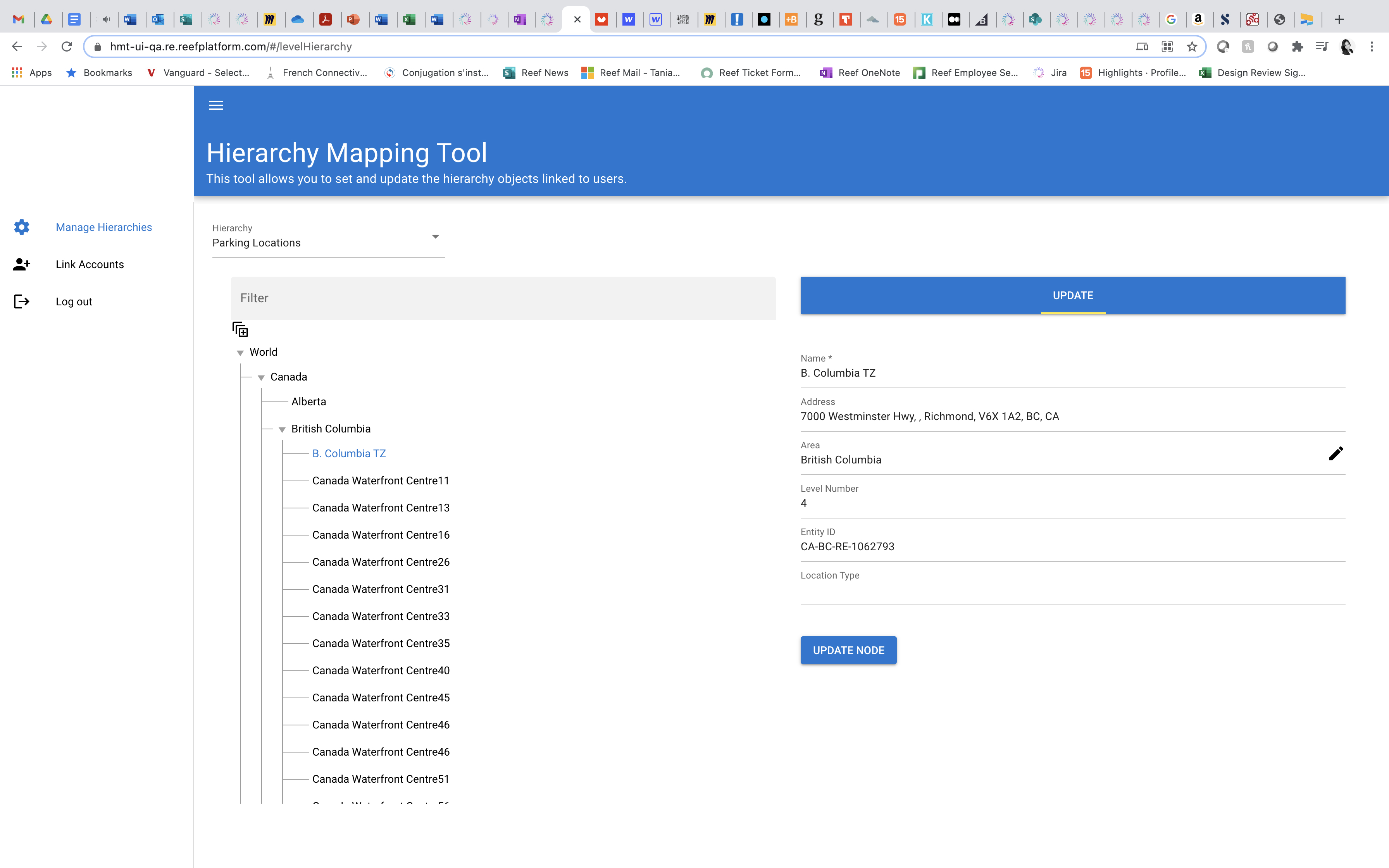
The Hierarchy Management Tool is a platform that reacts and automates organizational changes within REEF Cloud, an internal tool. It helps B2E users organize data access and accommodate multiple hierarchies and organizations outside REEF, basically functioning as an organizational chart.

Currently, data management is done manually and specifically through the IT team. Also, the platform is dependent on a Microsoft active directory to understand the organizational chart. This current solution is not flexible enough and cannot keep up with the growing, fast-paced changes within the organization.

Automate the Hierarchy Management Tool to allow scoping, viewing, modifying, and creating user’s access within the Reef Cloud platform. This allows the Cloud dashboard to be dynamic and tailored to the user’s role/ desired actions and provides a user-friendly and visual solution.

HMT already exists in REEF Cloud however, the user experience needed to be redesigned. I started by exploring the existing tool and flows in order to get familiarized with it and understand what it does. The redesign process was started by another designer and when I was handed down the project I worked closely with the designer to understand the vision and the goals we aimed for.
First, we evaluated whether we would move forward with a horizontal layout rather than a vertical one. Based on competitive analysis and reviewing existing tools like Pingboard, Lucidchart and others, we decided it was best to use a vertical layout. It’s easy to read and follow along the hierarchy.
V1 Horizontal layout
V1 Off center vertical layout
V3 Vertical centered layout
V4 Vertical layout highlighted
Feature
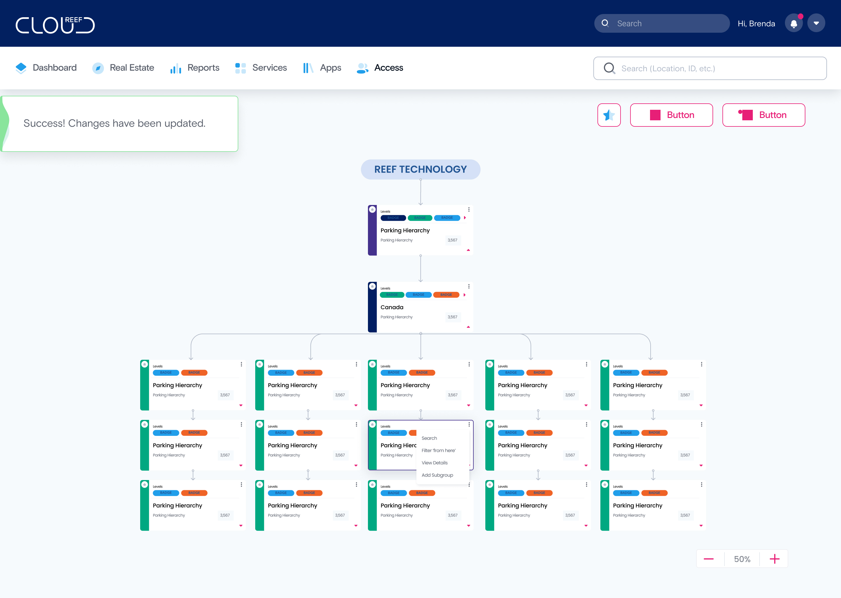
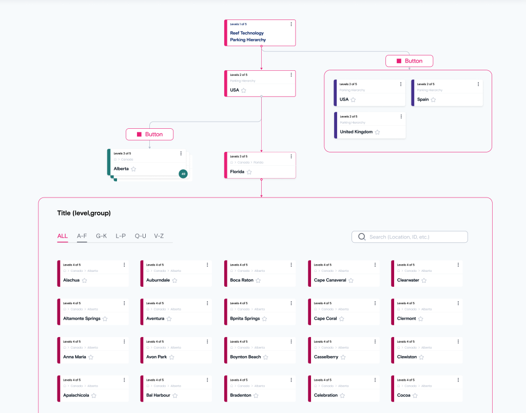
This first feature I worked on allows the users to expand and collapse the different levels in order to view linked accounts within a specific hierarchy.
Currently, the Hierarchy Mapping Tool looks like this, not so friendly nor aesthetically pleasing.
I explored several options, drawing inspiration from IOS patterns and others from existing platforms to incorporate the expand/ collapse feature. The intention was to not overcomplicate the design or the interaction by making it intuitive and user-friendly.
 V1 Expand/collapse via card
Expanding the level from the card seemed like a great idea but, there was confusion around the symbols. And the arrow on the card was clear as most testers viewed it as details of the card or expanding that card, not the level.
V2 Expand/collapse via card
The second iteration of this concept and still testers did not see the arrow as a way to expand the level

V3 IOS pattern
AHA Moment! This was a good solution but still needed tweaking.
V4 Adopting minus and plus buttons
This pattern got too complicated fast, many questions arose.

V5 Simple approach
This was the best solution, one button per level closing made the interaction easy.
Second, I reviewed the card design and went through various iterations to understand what information and actions would be helpful to the user.

V1 Light vs dark
The cards started in light colors for all levels, which would get a bit lost and blend in with the background, it was not accessible and contrast was absent. I started exploring darker colors and how the breadcrumbs would be shown on the card.
V2 Back to light
After several reviews, the colors seemed too strong. I was trying to find a happy medium where the cards would not blend in with the background or be too strong that the user could be distracted.
V3 Monochromatic anyone?
At this point, I was questioning the use of colors and thought maybe I should follow a monochromatic scheme, that way the user could learn that light meant lower levels. Still not being convinced I kept exploring and testing.

V4 Dark and strong
That’s how I like my coffee !...visually these cards needed that oomph. After testing and reviewing, the team agreed to move along with the stronger colors for each level. They now stand out and have several states. When selected, they turn blue to let the user know the selection they have made. The checkbox that lives within them, is specifically used to link users or accounts to the different levels. You’ll see soon! These are now components that are part of the Reef Cloud design system.
That’s how I like my coffee !...visually these cards needed that oomph. After testing and reviewing, the team agreed to move along with the stronger colors for each level. They now stand out and have several states. When selected, they turn blue to let the user know the selection they have made. The checkbox that lives within them, is specifically used to link users or accounts to the different levels. You’ll see soon! These are now components that are part of the Reef Cloud design system.
